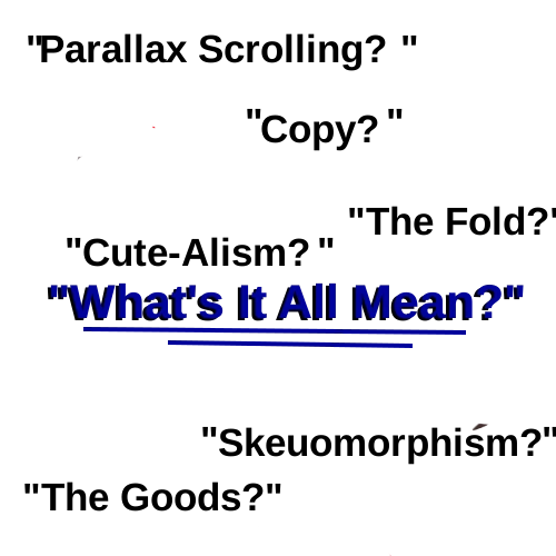
It’s tough enough as it is learning how to code, plus you have the web design slang to navigate as well. Some appear to make no sense what-so-ever. Below is a list of the most common terminology in web design slang, their definitions and how some got their name .
- 404 Page: Designers often spend a lot of time on these “error” pages to make them funny or helpful so the user doesn’t leave the site.
- Bento Grid: Inspired by Japanese lunch boxes, this is a layout style where content is organized into neat, varied-sized rectangular boxes. It’s very popular right now for dashboards and “Features” sections.
- Boilerplate: The “starter code” that we used to set up the index file. It was taken from the legaleze branch. It originally described the general standardized language in legal documents.
- Breadcrumbs: The little trail of links at the top of a page (e.g., Home > Tech > Software) that shows you exactly where you are in the site’s hierarchy.
- Bugs: When your code doesn’t work right (like forgetting a
</p>tag). Finding these is called “debugging”. - Copy: The actual text you write (like your “Take Me To Your Leader” joke). When you change the text, you’re “updating the copy.”
- Cute-alism: A 2026 trend that mixes the harsh, raw layout of “Brutalism” (plain fonts, heavy borders) with soft, cheerful, or “kawaii” icons and colors.
- Dark Mode / Light Mode Toggle: While standard now, designers often refer to the “Switch” or “System Preference” logic that swaps the entire color palette of a site.
- Favicon: That tiny little logo you see in your browser tab next to the website name.
- Glassmorphism: A design style that uses transparency, background blurs, and thin borders to make elements look like frosted glass floating over the background.
- Lazy Loading: A performance trick where images only load right as you are about to scroll to them. It keeps the initial page load super fast.
- Live: When your website is finally on the internet for everyone to see. “We’re going live, friends!”
- Micro-interactions: Those tiny animations that happen when you “Like” a post or hover over a button. They provide “feedback” to let the user know their action was registered.
- Parallax Scrolling: A visual effect where the background moves at a slower rate than the foreground, creating a 3D sense of depth as you scroll.
- Responsive: This means your website looks good on both a big computer screen and a tiny phone screen.
- Skeuomorphism: Making digital elements look like real-world objects (e.g., a “Delete” button that looks like a 3D physical trash can).
- Skins: Another word for CSS! Changing the CSS is like putting a new “skin” or “paint job” on your website.
- The Fold: Carried over from newspapers, this is the imaginary line where the screen ends. Anything “Below the Fold” requires a scroll to see.
- The Fold: This is an old newspaper term. Anything “above the fold” is what your readers see on the screen immediately without having to scroll down.
- The Goods / Assets: All the “stuff” that makes up your site, your photos. your HTML files, and your CSS.
- Thumb-Friendly: Design that places navigation and interactive buttons within easy reach of a user’s thumb when they are holding a mobile phone with one hand.
- Vibe Coding: A term popularized recently for using AI to generate the “look and feel” of a site through prompts rather than manual CSS.
- WYSIWYG (pronounced “Wiz-ee-wig”): Stands for “What You See Is What You Get.” It refers to website builders (like Wix or WordPress editors) where you can see the design as you edit it, rather than just looking at code.